Edward Tufte wrote a sentence that I have quietly used to settle a hundred design arguments: graphical elegance is often found in simplicity of design and complexity of data. Read it twice. It is not "keep it simple". It is a demand for two things that pull in opposite directions, a plain, quiet surface sitting on top of a great deal of information, and it insists you deliver both.
Most bad charts fail one side. The clip-art infographic is simple in design and simple in data: a big number and a shrug. The typical enterprise dashboard is the opposite, complex in design and thin in data: gradients, 3D bars, and drop shadows wrapped around six numbers. Elegance lives in the corner almost nobody reaches.
Take the sparkline , a whole time series the size of a word. It carries months of movement, a trend, a last value, and it never once raises its voice. Simple design, complex data, right there in the sentence.
The best graphics are about the useful and the important, about life and death, about the universe. Beautiful graphics do not traffic with the trivial.
Edward Tufte01Small multiples: repeat the frame, vary the data
The cleanest way to pour more data through a simple design is to repeat that design. Fix one small chart, then stamp it many times, one per category, per region, per month. The reader learns the frame once and then reads twelve stories at a glance, because comparison becomes a matter of scanning, not of remembering.
02Subtract until only the data is left
The other move is subtraction. Tufte's data-ink idea is brutal and freeing: of all the ink on the page, how much actually encodes a number? The rest, the gridlines, the fake depth, the boxes, the gloss, is overhead, and most of it can go. Toggle the same chart between decorated and stripped, and watch the numbers get louder as the ink gets less.
To clarify, add detail. Clutter and confusion are failures of design, not attributes of information.
Edward TufteThis is the line people misread. "Add detail" sounds like the opposite of simplicity, but Tufte means: do not solve confusion by removing information, solve it by designing better. The failure was never that there was too much data. It was that the design could not carry it.
03The surface must not lie
Simplicity buys you nothing if the design misreports the data. Tufte's other test is graphical integrity: the size of the effect on the page must match the size of the effect in the numbers. Break that and a clean, quiet chart becomes a clean, quiet lie.
Here is a broadcast weather graphic doing exactly that. The week runs 92, 92, 92, 94, 94, 92, 92. A two-degree spread, about two percent. Look what the bars do with it.
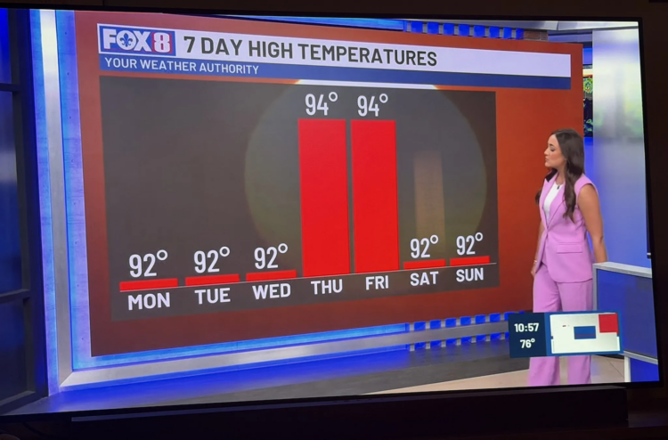
A bar encodes its value by length measured from zero. Cut the zero and the length stops meaning anything: the ink is no longer proportional to the number, and the reader's eye, which trusts area and height, is told a story the data never supported. Tufte put a name on the gap between the two, the Lie Factor, the size of the effect shown divided by the size of the effect in the data. An honest chart sits near one. This one is off by an order of magnitude.
The fix is not more design, it is less deception: start the bars at zero, or, if two degrees genuinely matters, drop the bars and plot the points on an honest scale that shows the week is nearly flat. Simplicity and integrity are not the same virtue. You need both, and integrity comes first.
04The masterpiece already in the Museum
If you want the whole idea in one image, it is hanging two clicks away. Minard's map of Napoleon's march is dead simple in form, a single thick line that thins as it goes, and staggeringly complex in data: army size, direction, geography, dates, and temperature, six variables braided into one quiet drawing. Simplicity of design. Complexity of data. Nothing trivial.
That is the bar. It is also the reason I build OVP the way I do: a chart should carry as much true data as it honestly can, on a surface so plain the reader forgets it is a design at all.