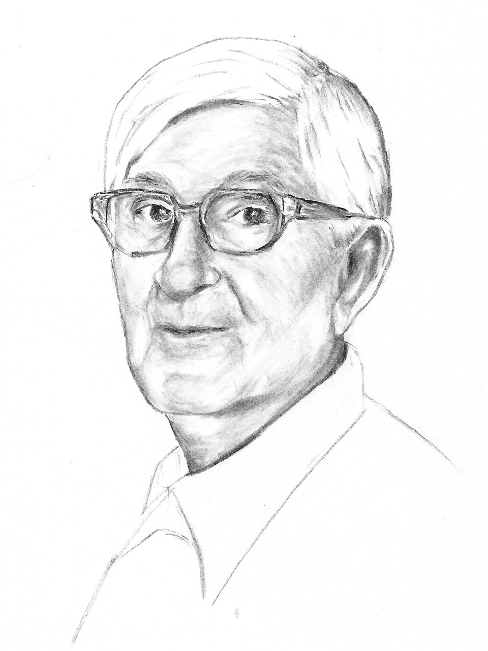
Portrait by Ida Berger, CC BY-SA 4.0, via Wikimedia Commons.
Josef Albers spent his life proving that the eye is a poor witness. His most unsettling demonstration is this: take two flat, fully opaque colours, place a third opaque colour where they meet, and if you choose that third colour precisely, the eye stops seeing three flat shapes. It sees two transparent films, one lying over the other. No paint is thinned. No pixel is see-through. The transparency is manufactured entirely inside your head.
He called it, plainly, the illusion of transparence. For anyone who overlaps data, two distributions, two sets in a Venn, two shaded areas, this is not a party trick. It is the exact mechanism that decides whether your overlap reads as layered information or as an ugly third category nobody asked for.
In order to use color effectively it is necessary to recognize that color deceives continually.
Josef Albers · Interaction of ColorStart with real transparency, so we know what we are faking. When any program overlaps two translucent shapes (Photoshop, Figma, a web browser, a charting library), it computes the colour where they cross using a blend mode. Watch what the same two circles do under three of them:
01The trick: fake the overlap with an opaque colour
Now Albers' move. Every colour below is 100% opaque, including the small rectangle in the middle. Drag it through the possible mixtures. Somewhere near the honest blend of the two, the flat patch dissolves and you suddenly see one pane resting on top of the other.
Choose the mixture one way and the warm pane floats in front; choose it the other way and the cool pane wins. The same two colours, reordered in depth by a single third colour:
The rule is small and strict, and it generalises into a wall of studies. Each tile below is two opaque panes plus one opaque overlap, and each one lies to you the same way:
02Why every overlapping chart lives or dies here
A two-set Venn, two overlapping histograms, two shaded time series: each asks the reader to see the intersection as both categories at once. That only happens if the overlap colour is the honest blend. Get it right and the intersection reads instantly. Get it wrong and you have accidentally invented a third group.
If one says "Red" and there are fifty people listening, it can be expected that there will be fifty reds in their minds.
Josef Albers · Interaction of ColorAlbers' point was humility: you cannot trust that the colour you chose is the colour anyone receives. The overlap is where that uncertainty is sharpest, because the reader is doing arithmetic with your colours whether you meant them to or not.
03What a protocol has to promise
If the overlap colour carries meaning, it cannot be left to whoever drags the opacity slider last. A design system has to define the blend, not just the two base colours: state whether overlaps multiply like ink or screen like light, and derive the intersection colour from that rule, every time, the same way.
That is one of the quieter promises inside OVP: an overlap is not a fourth swatch to pick, it is a computed consequence of two roles and a stated blend. Albers arrived at the same discipline with cut paper, sixty years and one medium earlier. And the masters he anticipated are next door, in the Museum.